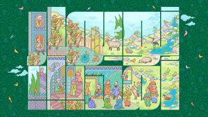
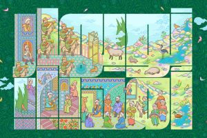
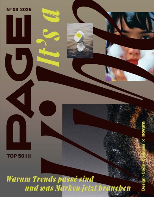
PAGE gefällt …: Illustrationen des Londoners Pâté, der das Alphabet in schönste Anzüglichkeiten verwandelt und WiFi-Spots in Kunst und dabei mit großartig simplen Formen und leuchtenden Farben spielt.
Name Pâté
Location Dalston, London
Web www.pateontoast.co.uk
Instagram @pate_on_toast
Start Soweit ich mich zurückerinnern kann, habe ich eigentlich immer gezeichnet. Irgendwann bin ich dann zum Art College gegangen, habe anschließend einen BA in Visueller Kommunikation an der UCE in Birmingham gemacht und wurde von der Welt der Werbung verführt. Nach ein paar Jahren als Art Director stellte ich dann fest, dass ich gar nicht mehr zeichnete und wie ich es vermisste. Und lange Rede kurzer Sinn, fanden mein damaliger Kreativpartner und ich einen Kunden außerhalb der Agentur für den wir texten konnten und ich die Anzeigen illustriete. Die Arbeiten, die so für das Victoria & Albert Museum of Childhood entstanden, gewannen für die Illustrationen zahlreiche internationale Preise. Ich habe daraufhin bei einem Agenten für Illustration unterschrieben, bis 2012 zwei Karrieren parallel verfolgt und anschließend die Werbung aufgegeben, um mich ganz der Grafik zu widmen.
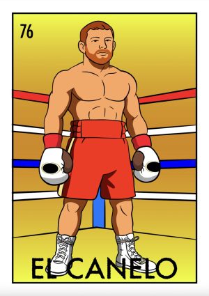
Stil Ich beginne immer mit einer Idee. Und da ich weder im Leben noch in der Kunst ein Fan von Zweideutigkeiten bin, versuche ich ganz simpel und klar zu kommunizieren, gleichzeitig aber immer noch Raum für den Betrachter und seine eigenen Lösungen zu lassen. Als nächstes nehme ich den Humor unter die Lupe, ist er lustig oder originell und clever? Anschließend suche ich nach Schönheit. Stilistisch liebe ich flache, grafische Bilder und seit neuestem leuchtende, vibrierende Farben. Auch ist es mir wichtig, die eigene Handschrift zu verwischen, um die Idee in den Vordergrund zu stellen. Neulich sagte jemand über mich und meine Arbeit: »Er ist ein Problemlöser, der deine Augen um Lachen bringt«. Das hat mir wirklich gefallen.
Lieblingsmotive Objekte wie Buchstaben. Visuelle Wortspiele. Das Tropfen und Spritzen.
Technik Ich fange an, indem ich Worte, Phrasen und Ideen in einem Notizbuch skizziere. Ich liebe die Präzision und Genauigkeit, deshalb benutze ich beim Zeichnen eines Objekts die Google-Bildersuche oder gehe in Läden und Museen, um vollständig zu verstehen, wie ein Ding funktioniert oder aussieht. Wenn ich einen Gegenstand zeichne liebe ich die Idee, dass, stellte man ihn her, tatsächlich funktionieren würde. Wenn ich Menschen zeichne sitze ich gerne in Cafés und schaue mir die Leute an und die schicksten oder schrägsten finden immer einen Weg in meine Arbeiten.
Wenn eine Idee mir schließlich gefällt, arbeite ich am Computer und mit Adobe Illustrator weiter. Ich liebe Vektor-Illustrationen. Schon als Kind habe ich es gehasst, wenn ich mit Filzstiften etwas ausgemalt habe und die Farbe über die Linien trat. Ich hab dann immer und immer wieder über ein und dieselbe Fläche gemalt, um die flache und dichte Farbe, die ich an Ausmalbüchern so geliebt habe, wieder herzustellen. Nun kann ich das mit einem Klick!
Inspiration Tolle Ideen entstehen in jedem Bereich kreativen Bemühens. Ich tendiere auch dazu, auf der Suche nach Inspiration nach Innen zu schauen, auf meine Erinnerungen und Erfahrungen. Außerdem dient die Angst, die nächste Hypothek nicht zahlen zu können durchaus auch zur Inspiration!
Kunden British Airways, Creative Review, Discovery Channel, Google, MOO, Nyetimber, The Observer, Shop Magazine, Transport For London, V&A Museum Of Childhood, Virgin Media, Vodafone, The Washington Post, Wired Magazine.
Agent Blink Art in England, Tiphaine in Frankreich, Synder New York in den USA
Name Pâté
Location Dalston, London
Web www.pateontoast.co.uk
Instagram @pate_on_toast
Start From as early as I can remember I’ve always drawn. I went to Art College and then studied for a BA (Hons) Degree in visual communications at UCE in Birmingham, where I was seduced by the world of advertising. After some years as an art director I realized I was no longer drawing and I missed it. To cut a long story short my then creative partner and I found a client outside of our agency roster that we could write ads for and that I could illustrate. The work we produced for V&A museum of childhood went on to win lots of global awards especially for illustration. From there I signed with an illustration agent and parallel tracked two careers until 2012, when I quit advertising to pursue graphic art full time.
Style I start with ideas first. I’m not a fan of ambiguity in life or art so I try to communicate simply and clearly, but at the same time leaving something for the viewer to resolve for themselves. Next I look for humour, is it funny or wittily clever? Then I look for beauty. Stylistically I love flat graphic images and more recently bright, vibrant colour. I’m interested in the removal of the artists’ hand leaving you free to appreciate the idea. Someone recently said of my work, “He’s a problem solver that make your eyes smile”, which I really like.
Favourite motifs Objects as letters. Visual puns. The drip and splash.
Technique I start by writing words and phrases and sketching ideas in pencil in a notebook. I love precision and acuracy so if I’m drawing an object I use Google image search or visit shops and museums to understand fully how the thing works or looks. I love the idea that the when I’ve drawn a thing, if it were to be made it would actually function. If I’m drawing people I love to sit in cafes and people watch, the most stylish or wierd people always find their way into my work.
When I’m happy with the idea I’ll move onto the computer and Adobe Illustrator. I love vector illustration. When I was a child I used to hate the overlapping lines produced from colouring in with felt tip pens. I used to go over and over and over the same areas of colour to try and replicate the flat, solid colour of the comic books I loved. Now I can do it in one click!
Inspiration Great ideas executed brilliantly in any field of creative endevour. I also tend to look inward for inspiration, to my memories and experiences. And the fear of missing a mortgage payment!
Clients British Airways, Creative Review, Discovery Channel, Google, MOO, Nyetimber, The Observer, Shop Magazine, Transport For London, V&A Museum Of Childhood, Virgin Media, Vodafone, The Washington Post, Wired Magazine.
Agent Blink Art in the UK, Tiphaine in France, Synder New York in the USA