PAGE online

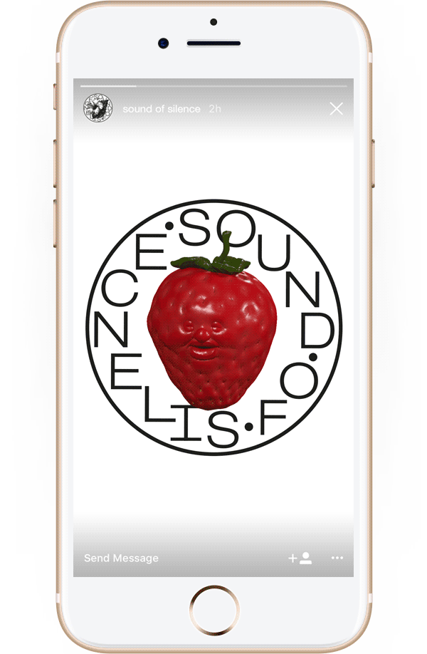
Yoga anders: Identity für Sound of Silence

Das Studio Córdova Canillas ist bekannt für seinen hippen Style – und beweist ihn auch in dieser Identity für das Meditations- und Yoga-Studio Sound of Silence.
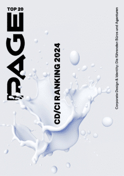
In der aktuellen PAGE 09.2018 stellen wir kurz die herrlich ungewöhnlich andere Identity vor, die das Designstudio Córdova Canillas entwickelte, bekannt für das Editorial Design hipper Mode, Kunst- und Lifestyle-Magazine.

Für das Yoga- und Meditationsstudio Sound of Silence in Barcelona verbanden sie den »Kreis des Lebens« mit launigen Gifs, grinsenden Erdbeeren, Monstera-Blättern und anderen Insignien des modernen Lebens.

Sound of Silence | Logovariante
Bild: Córdova Canillas
1/18
Sound of Silence | Logo Typografie
Bild: Córdova Canillas
2/18
Sound of Silence | Logokonzeption
Bild: Córdova Canillas
3/18
Sound of Silence | Logovariante
Bild: Córdova Canillas
4/18
Sound of Silence | Logovarianten
Bild: Córdova Canillas
5/18
Sound of Silence | Web
Bild: Córdova Canillas
6/18
Sound of Silence | Einladungskarten
Bild: Córdova Canillas
7/18
Sound of Silence | Einladungskarten
Bild: Córdova Canillas
8/18
Sound of Silence | Visitenkarten
Bild: Córdova Canillas
9/18
Sound of Silence | Webseite
Bild: Córdova Canillas
10/18
Sound of Silence | Web
Bild: Córdova Canillas
11/18
Sound of Silence | Web
Bild: Córdova Canillas
12/18
Sound of Silence | Beutel
Bild: Córdova Canillas
13/18
Sound of Silence | Button
Bild: Córdova Canillas
14/18
Sound of Silence | T-Shirt
Bild: Córdova Canillas
15/18
Sound of Silence | ID-Card
Bild: Córdova Canillas
16/18
Sound of Silence | Flagge
Bild: Córdova Canillas
17/18
Sound of Silence | Münze
Bild: Córdova Canillas
18/18


Produkt: Download PAGE - Corporate Design - kostenlos
Download PAGE - Corporate Design - kostenlos
eDossier: Corporate Design in Zeiten schnellen Wandels.Jetzt downloaden!

Kommentare zu diesem Artikel

  1. Katastrophe! Da hat doch der AD/CD n kleinen Hang Over gehabt. Visuell nur zu provozieren um anders zu sein reicht nicht. Dieses Design macht keinen Spaß beim lesen sondern Kopfschmerzen. Bildet zum Klangvollen Brand nur einen seltsamen visuellen Kontrast der an antike Telefone erinnert. No.

  2. mann, ist dass hässlich … da helfen selbst die mockups nicht.

Schreibe einen Kommentar

Deine E-Mail-Adresse wird nicht veröffentlicht. Erforderliche Felder sind mit * markiert.

Das könnte dich auch interessieren