PAGE online

»Every creature has their own unique lens on the world«

The works of artist and graphic designer J.S. Weis from Portland, Oregon, let nature and consumerism collide – and show us the world anew

Portrait Picture of artist J.S. Weis
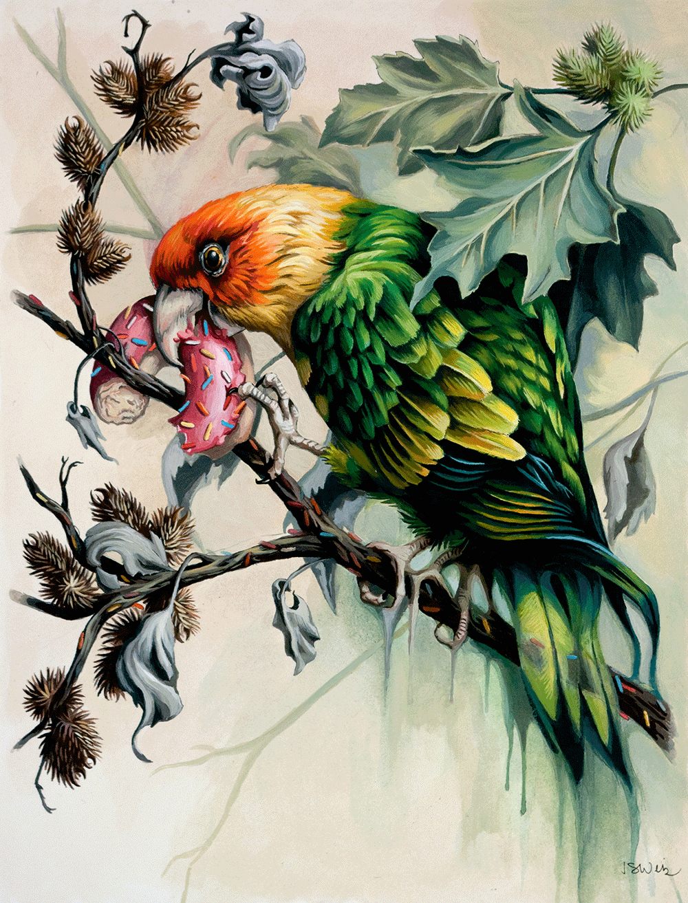
As a child, artist and graphic designer J.S. Weis from Portland, Oregon, roamed the woods. Today, in works like Ghost with Sprinkles (below), he shows how our affluent society is changing flora and fauna

In gloomy colors and with the precision of a nat­uralist, J.S. Weis displays what we humans are doing to nature. Influenced by a childhood spent mostly in the woods, and driven by the hope that we are ca­pa­­ble of changing things, he takes us up to the treetops where parrots are nibbling on sugar coated donuts or down into the ocean where crawdads live in cans. We talked to J.S. Weis about antlions and octopuses, why it’s sometimes good to forgo color – and why being a graphic designer as well is not without conflict for him.

Artwork picturing a parrot eating a donut by J.S. Weis. Title: Ghost with Sprinkles
Ghost with Sprinkles

You have a close relationship with nature. As a child, you walked through the woods near your house, caught fireflies and many other things. What are your memories of that time?
J.S. Weis: We moved around a lot when I was grow­ing up. First my dad was in the Navy and then he reme­diated nuclear sites. We lived in California, in Ohio, Virginia, and at several places in each of these states. So that’s a pretty good range of different ecosys­tems (laughs). We were always out in nature, hik­ing, fishing, wandering through the woods, picking up insects and studying them. But we also piled up sand and put antlions in it to watch how these preda­tors build cones of sand to catch other insects and execute them.

And your parents also cultivated an interest in science in you.
They always encouraged us to look up anything. If we didn’t know the species or the name of an animal, Dad pulled our Audubon Society Field Guide off the bookshelf. With his science background he raised us to explore things and to see them as objectively as possible.

Today, nature has changed. We live in the age of the Anthropocene. Has this altered your perspective on nature?
My work is about the ecosystem of plants and animals being replaced by an ecosystem of products. But at the same time, I see a lot of parallels between these systems. Capitalism is also about competition and that the best ones become dominant. Living in the age of the Anthropocene is scary but interesting as well. Our natural history took millions of years to evolve. But we separated ourselves from nature and built our own engineered world on top of it. Think­ing about them coexisting has always fascinated me.

But the ecosystem of products is an ecosystem of waste.
That is part of the problem. In the natural ecosys­tem, waste is never waste. It gets consumed by fungi and other scavengers. But our man-made system is not capable of that, so it’s full of waste. We’re all feel­ing and seeing it.

Artwork by J.S. Weis picturing the transformation of a dragonfly into skittles. Title of the Artwort is Skittlefly.

Artwork by J.S. Weis depicting blue Steller’s Jays feeding on Oreo cookies. Title of the Artwort: The Revelers Forest.
Waste everywhere – and so a dragonfly turns into a Skittlefly (above) and beautiful, blue Steller’s Jays nibble on harmful Oreo cookies

Even in the water . . . You had a startling experience snorkeling in Puerto Rico.
Oh yes. I had to swim out past floating beer cans, plastic bags, and a sneaker. But a quarter mile further, I suddenly saw Caribbean reef squids that can change their color and also brown pelicans that were catching fish. It was really magical for me to see all these rhythms of nature. That was a juxtapose against all this trash. In my work I’m trying to hold those two thoughts simultaneously and to explore the ten­­sions between them.

Your experience sounds like a very beautiful and very sad moment at the same time.
Yes, that’s accurate. And it’s a moment that stuck with me. I’m looking out of my window right now and it’s always that mix of natural and man-made.

Often it is hard to tell what’s natural anymore because we’ve changed the planet so much.

You’re right. When you look at the sky, clouds can be man-made and there are the contrails of the airplanes.
People have always fiddled with the environment so that it better suited us. And it’s not even a unique human behavior, because beavers and plenty of other ani­mals do it too. But we definitely take it to an extreme. I don’t know if I’ve been in a perfectly intact ecosys­tem ever. I’m thinking of Yosemite. It’s so beauti­ful that lots of people come to visit, but driv­ing through is a highly engineered experience. Or here in the Pacific Northwest where I live, you see a lot of trees along the highways. But that doesn’t ­mean that’s nat­ural. Because less than ten percent of the old growth forest here is intact and those trees are grown in order to be harvested later.

Artwork by J.S. Weis picturing an underwater turtle covered in and morphing into garbage.
On dives, J.S. Weis observes how our garbage pollutes the oceans and depicts how squids are living in sneakers and how an underwater turtle, overgrown with trash and action figures, transforms into a tragic mutation

When did all these observations become part of your work?
In college, I tried on lots of different styles and themes. But I always kept circling back to nature. I just like looking at how a leaf, an animal, or an insect is struc­tured and I enjoy painting or drawing them. But ev­ery time I would do that, I couldn’t get out of my mind how endangered nature is. So, I tried to find a way to put those two ideas together.

At one point you started calling yourself an (un)naturalist.
I changed that to “trashy naturalist” (laughs). I try to draw things that are carefully observed, like a natural­ist would, and then bring the man-made elements into it. I thought that term encapsulates this best.

And now you’re also working on a book that lets you dive into the ocean visually.
It started out as one book, but I had to split it in two. One is Letters to the Duck, the other The Fable Ocean, and I’m going back and forth between them. The first one is about a person reflecting on the material wealth of their childhood with all these toys and wondering where they ended up. It’s influenced by a true story about a container that fell into the water on the high seas with thousands of toys in it that lat­er appeared in all different kinds of places. The other stories are dark fables about anthropomorphized animals and also set in the ocean.

How do you decide which animal to paint? Do you have any favorites?
Probably the octopus. I painted more octopuses than any other animals. They are invertebrate, highly in­­telligent, and come from a completely differ­ent evo­lutionary path. Their intelligence is diffused through their body. So how does it feel to experience the world when your brain is all throughout your ­body? How is it to taste things by touching them or to change your skin texture and col­or? Every creature sees the world through their own unique lens. But I find the traits that an octopus has especially interesting. They’re so different from us.

An Artwork by J.S. Weis depicting a morphed beetle with litter and the icons of Facebook and twitter on the head.
Once a wondrously beautiful and exciting beetle, now a strange hybrid Tweetle into which an individually wrapped cookie, Facebook and Twitter have eaten their way

And the other animals? How do you choose them?
The piece I’m working on right now, I started after I saw a pizza slice hovering over the ground in the park­ing lot of my building. It was like a ghost pizza, because it was just floating (laughs). But then I saw that there was a squirrel behind it hauling the pizza off into the woods. That’s how the idea of a pizza party in nature evolved. But it’s always different. Sometimes be­hav­ior is decisive for choosing a certain animal, some­times its ecosystem, sometimes it’s just intuition.

How would you describe your style? How did it develop?
Lately, I think it‘s influenced by the classically posed naturalistic prints from John James Audubon into which I’m introducing man-made stuff.

But it has much more emotion in it than the naturalistic prints and a special intensity.
It would be wonderful if that were so. Much of the mood in the naturalistic prints is conveyed through the sky and the lighting – or even a storm. I don’t work with that. But as soon as you put in the trash, a subtext is there.

How do you develop your works?
I’ll do sketches and sometimes a photo collage. A lot of my ideas come from Google searches. I can go hours just looking at different images. The last thing I was studying were balloons. Usually, they don’t inter­sect with my life at all. But there are so many different kinds and it’s a job designing them. Once I have an idea for the ingredients of a painting, I do a little bit of sketching and maybe the composition. It’s like the mood boards you sometimes make in graphic design. When I start to paint, I get to the big shapes and flat areas of color first. But then I don’t do it in any particular order. I just jump around. It’s chaos (laughs). I just do whatever feels good.

And how do you decide if you do something in color or in black-and-white?
For me, it’s good to switch between color and black-and-white, and sometimes even quit painting in ­col­or for a while. I then appreciate it more afterwards and I’m seeing the colors more precisely than before. I think I just go through phases.

Drawing of J.S. Weis depicting a cormorant and some seagulls in a severely littered seaside-environment.
The cormorant has wonderfully bright eyes. Nevertheless, J.S. Weis decided to draw it in black and white, focusing entirely on the McCormorant’s body structure, feathers – and horrible littered environment

It’s not like birds have to be in color because they’re so beautiful?
I did a black-and-white of a cormorant. They do not have the most colorful plumage, but their eyes have a gorgeous color. I was a little sad that I couldn’t show it. But I can always do it another time (laughs). I don’t know if I would pick a parrot to do in black-and-white. But they have a really fascinating beak shape and the structure of a body can be very interesting too. And as people are so used to the brightness of parrots it can be interesting to take the color out and to focus on something else.

After college, you worked as a graphic designer and you still do. Where do these two worlds meet?
Definitely on the aesthetic side. Trying to come up with good compositions, with interesting colors, and that things feel balanced. I do love really good graphic design. I worked as a graphic designer with agencies and tech places. I did illustrations for Facebook, brand­ings for restaurants and things like that. But I also worked in screen-printing and I think that influenced my art when I started to paint again sev­eral years later. In order to make money, some screen-printing places do junky products like plastic pens with the company’s logo on them. Even back then it seemed such an outdated and wasteful promotional idea. Sometimes I think all my art afterwards is also about working out some guilt (laughs). I’ve never enjoyed selling things. And the hard part in graphic de­sign is often the intent behind it. It’s part of the ecosystem of products which I’m questioning in my art.

When you say you appreciate really good graphic design – what is that for you?
It’s the aesthetics. The other night I was at a dinner for my aunt’s 70th birthday. My cousin was talking about some Japanese barbecue sauce she bought be­cause she really liked the graphic design on the pack­age. That was the start of her engagement with that product. Good graphic design does that for people. I like old packaging that seems fussy to our current aesthetic because there’s just so much going on. I have a tobacco tin that has a paper seal on it that is so detailed it looks like a banknote. But I also like modern designs. It can be really everything.

How do you choose your graphic design projects? I looked through some of your work and the beaver with the golden teeth for the Hardwood Bar & Smokery looks so nice and funny, as do the food illustrations for the restaurant Manhattan House.
For anything I do, I want the craft to be good. And there’s a social aspect to graphic design. When you collaborate with people, it can be really fun to share your ideas and to try out different ones.

Logo by J.S. Weis for the Louie's Bar in San Francisco depicting a cigar-smoking and well dressed whale.
J.S. Weis also works as a graphic designer and his style is unmistakable in this logo for Louie’s Bar in San Francisco

Being in the middle of climate change, your work is frighteningly up-to-date. Do you think it has the power to drive change? Or to give hope?
I understand myself as an observer. And my art is about what I see. I often ask myself what it would do to us psychologically when in 200 years nature will be ­re-­­­ally precarious, so many species gone, when we have mono­cultures of corn and completely engineered ecosystems. I don’t know what’s going to happen, but I would much rather live with hope. I think people have an amazing capacity to change the world. But our focus isn’t where it needs to be right now. So maybe I’m trying out different ways to bring it into focus. I am definitely not saying we’re doomed, but I am saying we’re in trouble. We all know that.

Dieser Artikel ist in PAGE 10.22 erschienen. Die komplette Ausgabe können Sie hier runterladen.

PDF-Download: PAGE 10.2022

Website-Builder: Aus ready-made wird customized ++ Futures Design: Praxis & Cases ++ ENGLISH SPECIAL J.S. Weis ++ Boom: Design für Reinigungsmittel ++ Kartendesign: Dos and Don’ts ++ Plakate per Buchdruck: Dafi Kühne ++ Neue DIN mit Variable-First-Ansatz ++ Förderungen für Kreative ++ EXTRA: Top 20 CD/CI-Agenturen

9,90 €
AGB

Schreibe einen Kommentar

Deine E-Mail-Adresse wird nicht veröffentlicht. Erforderliche Felder sind mit * markiert.

Das könnte dich auch interessieren